


 DJShahar.com
The current folder browser offers a wide range of options for managing music.
However, it is not that friendly though.
So, while looking at other software and brainstorming in front of the computer, I have created a much more sophisticated browser.
First I have taken all of the icons and placed them at the top in a Horizontal rule.
Instead of having many known icons take up much space, they are all cramped up in one line.
Volumes, Desktop, Genres, History, iTunes, Crates, Playlists, Favorites, Virtual Folders, Filter Folders

Each icon opens up its own panel beneath the bar of browser icons.
Here is an example panel for filter
And now I would like to suggest new browser panels.
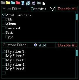
First and most important is the filter panel. It is split into two types of filtering options.
The first and ultra user friendly is the Auto Filter. Here is what it looks like.
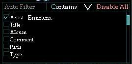
At the top left is a label Auto Filter, next is a filtering type: Contains with a drop down menu for is exactly, is not, etc, and to the right of that is a Disable All button which unchecks all check boxes.
Check boxes enable and disable a filter parameter: Ex Artist. Title, Album, etc.
A user may type in text next to each filter type. this example filter is written as: Artist contains Eminem
A user may check multiple filters at the same time. There is also a scroll bar to navigate through all available auto filter types.
I suspect Auto Filter will make a world of difference for us when we quickly filter out a specific parameter with out writing a code.
The second filter type is the one currently in existence with a few improvements. Here is what it looks like.
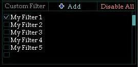
At the top left is a label Custom Filter, in the top center is the button to add a new filter, and to the top right is a Disable all button.
Beneath the label are all the filters created by the user him/her self. checkbox, scrollbar, Disable all button is the same.
The new history panel.
This is a personal favorite especially since it now contains a built in calendar which shows the day, month, date, year, and weak of the history
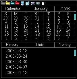
Top row contains the usual icons.
History panel contains a calendar labeled calendar, month, and year. click on month to go to any specific month, click on year to go to any specific year. just as you would with windows. aside from that, there is also a scrollbar to move through the calendar quickly by month. day numbers of active month is brighter.
beneath the calendar is history and when clicking on a specific history file, the calendar automatically goes to that specific month and highlights the day. vise-versa when clicking on a specific date, the history files scrolls up or down to the closest specified date.
The new Playlist panel:
My first intention was to make this a user friendly and useful panel to help us not just view playlist but to create new ones as well.
So here is what my newly suggested Playlist panel looks like.
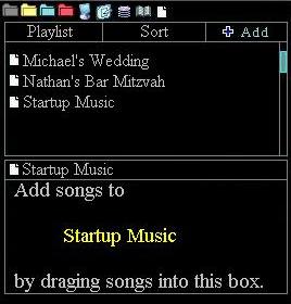
With various skins, the icons and text can get pretty small, and it becomes very difficult to add songs to playlists.
my suggested playlist panel allows the user to see all playlists available, sort them by any sort method availiable, and create new ones on the spot.
adding songs is easy as drag and drop.
Volumes, Desktop, Genre, and Virtual folders are simple tree trype folder operation same as current. except they now each have their own dedicated panel. it would be nice to have add a sort button to each panel, alpha a-z, alpha z-a, date, size, path, etc. since i do not have crates and i do not have ituenes, there will be no suggestions.
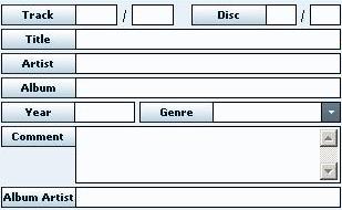
new icon: Info.

this handy little thing shows all information availiable when clicking on a music file. All data available.
ID3 info,
bpm, length, artist, title, comment, filepath, album, genre, key, bitrate, year, play count, first seen, first play, last play, drive, filename, filetype, filesize, filedate, linkedVideo, camelot, composer, etc.
I would draw you details, but tag scanner has a much better example
i sincerely hope this wish for new features is taken into consideration as it has taken me much time to write, draw, and post this topic.
DJ Shahar
Professional Wedding DJ
However, it is not that friendly though.
So, while looking at other software and brainstorming in front of the computer, I have created a much more sophisticated browser.
First I have taken all of the icons and placed them at the top in a Horizontal rule.
Instead of having many known icons take up much space, they are all cramped up in one line.
Volumes, Desktop, Genres, History, iTunes, Crates, Playlists, Favorites, Virtual Folders, Filter Folders
Each icon opens up its own panel beneath the bar of browser icons.
Here is an example panel for filter
And now I would like to suggest new browser panels.
First and most important is the filter panel. It is split into two types of filtering options.
The first and ultra user friendly is the Auto Filter. Here is what it looks like.
At the top left is a label Auto Filter, next is a filtering type: Contains with a drop down menu for is exactly, is not, etc, and to the right of that is a Disable All button which unchecks all check boxes.
Check boxes enable and disable a filter parameter: Ex Artist. Title, Album, etc.
A user may type in text next to each filter type. this example filter is written as: Artist contains Eminem
A user may check multiple filters at the same time. There is also a scroll bar to navigate through all available auto filter types.
I suspect Auto Filter will make a world of difference for us when we quickly filter out a specific parameter with out writing a code.
The second filter type is the one currently in existence with a few improvements. Here is what it looks like.
At the top left is a label Custom Filter, in the top center is the button to add a new filter, and to the top right is a Disable all button.
Beneath the label are all the filters created by the user him/her self. checkbox, scrollbar, Disable all button is the same.
The new history panel.
This is a personal favorite especially since it now contains a built in calendar which shows the day, month, date, year, and weak of the history
Top row contains the usual icons.
History panel contains a calendar labeled calendar, month, and year. click on month to go to any specific month, click on year to go to any specific year. just as you would with windows. aside from that, there is also a scrollbar to move through the calendar quickly by month. day numbers of active month is brighter.
beneath the calendar is history and when clicking on a specific history file, the calendar automatically goes to that specific month and highlights the day. vise-versa when clicking on a specific date, the history files scrolls up or down to the closest specified date.
The new Playlist panel:
My first intention was to make this a user friendly and useful panel to help us not just view playlist but to create new ones as well.
So here is what my newly suggested Playlist panel looks like.
With various skins, the icons and text can get pretty small, and it becomes very difficult to add songs to playlists.
my suggested playlist panel allows the user to see all playlists available, sort them by any sort method availiable, and create new ones on the spot.
adding songs is easy as drag and drop.
Volumes, Desktop, Genre, and Virtual folders are simple tree trype folder operation same as current. except they now each have their own dedicated panel. it would be nice to have add a sort button to each panel, alpha a-z, alpha z-a, date, size, path, etc. since i do not have crates and i do not have ituenes, there will be no suggestions.
new icon: Info.
this handy little thing shows all information availiable when clicking on a music file. All data available.
ID3 info,
bpm, length, artist, title, comment, filepath, album, genre, key, bitrate, year, play count, first seen, first play, last play, drive, filename, filetype, filesize, filedate, linkedVideo, camelot, composer, etc.
I would draw you details, but tag scanner has a much better example
i sincerely hope this wish for new features is taken into consideration as it has taken me much time to write, draw, and post this topic.
DJ Shahar
Professional Wedding DJ
发表时间 Sun 04 Jan 09 @ 3:14 pm
 SBDJ
SBDJ
Just my take on this, so don't shoot me ;)
I think the actual browser modifications are unnecessary, overcomplicated and more awkard to control. You need to remember that not everyone is using a mouse to control VDJ. The icons at the top, out of the actual browser list? This type of design would upset people who use MIDI controllers to browse; at present it is easy to simply scoll up and down the list and expand folders from a controller. It also complicates custom mapper design and controller layout.
The same thing applies to the panels - again, not easy to operate without a mouse. At the moment I can go from history to a filter folder, to an actual folder just by scrolling through the list. No need to flip panels or mess around.
I guess it boils down to the fact that I'm a fan of simplicity over clutter. The skin I use has almost no controls, just good size waveforms, video windows, deck information and browser. Almost no actual controls at all. I prefer to do almost everything from my two MIDI controllers - having to use the laptop to navigate the browser due to it's complexity would cause me to either switch software or look at creating my own!
djkz wrote :
First I have taken all of the icons and placed them at the top in a Horizontal rule.
Instead of having many known icons take up much space, they are all cramped up in one line.
Volumes, Desktop, Genres, History, iTunes, Crates, Playlists, Favorites, Virtual Folders, Filter Folders
Instead of having many known icons take up much space, they are all cramped up in one line.
Volumes, Desktop, Genres, History, iTunes, Crates, Playlists, Favorites, Virtual Folders, Filter Folders
I think the actual browser modifications are unnecessary, overcomplicated and more awkard to control. You need to remember that not everyone is using a mouse to control VDJ. The icons at the top, out of the actual browser list? This type of design would upset people who use MIDI controllers to browse; at present it is easy to simply scoll up and down the list and expand folders from a controller. It also complicates custom mapper design and controller layout.
The same thing applies to the panels - again, not easy to operate without a mouse. At the moment I can go from history to a filter folder, to an actual folder just by scrolling through the list. No need to flip panels or mess around.
I guess it boils down to the fact that I'm a fan of simplicity over clutter. The skin I use has almost no controls, just good size waveforms, video windows, deck information and browser. Almost no actual controls at all. I prefer to do almost everything from my two MIDI controllers - having to use the laptop to navigate the browser due to it's complexity would cause me to either switch software or look at creating my own!
发表时间 Sun 04 Jan 09 @ 6:47 pm
DJShahar.com
i completely forgot about the midi controller used to navigate thourgh the browser.
so here is an example of browsing using numarks midi controller
click on folder to scroll though the horizontal row of folders.
then push folder again to scroll though it's panel.
or an alternative method
keep clicking on "folder" to scroll through the top row, and use the scroller to scroll through the panel its self.
that sounds easy to me. does it sound easy to you?
amazing new features of my suggested new browser system is it is easy and simple AND it has new improvements.
if you just want to search by specific artist, or title, bpm, year, and so on, you can.
if you want to know what day [sunday, saturday, etc] that history playlist was created, you can.
if you are viewing your actual harddrive folder in e:\my music\subfolder 1\subfolder 3\artist folder\... and you want to go to a specific filter folder with out scrolling through 300 folders up or down, you can.
easy jumping is not a complication. it is EASY and it is JUMPING from one panel to another.
发表时间 Mon 05 Jan 09 @ 11:32 am
SBDJ
It's still over complicated for MIDI control IMHO. When you're in a hurry flicking through the browser, the last thing you want to be doing is messing around with extra button presses and worrying about what panel you currently have the focus too.
Just my opinion - as I said, I always prefer simplicity. Others may well agree with your point of view :)
Just my opinion - as I said, I always prefer simplicity. Others may well agree with your point of view :)
发表时间 Mon 05 Jan 09 @ 12:06 pm
DJShahar.com
simplicity is very important to me as well.
the current browser looks way too cluttered at the moment. and since i'm always adding new filters, new virtual folders, the history is getting longer, the playlists are increasing in number. favorites folder getting larger in number, all of these just make the current browser all the more complicated.
my suggested panel system gets rid of the clutter and simplifies the browser by having each type of older: virtual, filter, actual, etc. have its own panel.
my goal IS to simplify.
do you have any suggestions for the browser to simplify it.
if so, please do share.
发表时间 Mon 05 Jan 09 @ 4:14 pm
SBDJ
To be honest I'm happy with the browser as-is. It's perfectly functional for my requirements. Your method is probably more organised, but don't confuse that with simplicity of operation.
My HC4500 is mapped so that I can scroll up and down the file list with the parameter control, and up and down the folder list with by holding the back button whilst using the parameter control. This allows me to select and file/folder I want, without having to worry about what pane I'm in, where my browse focus is, and so on. It's absolutely perfect for me :)
The only thing I would probably add would be the ability to have subfolders, so you could effectively create a group of virtual/filter folders, and favorites under one folder, and browse it like all the others. I would probably also implement automatic history grouping in a similar manner. This would limit the number of folders most of the time in the left folder pane.
发表时间 Mon 05 Jan 09 @ 5:14 pm
 Tear Em 'Up
SBDJ wrote :
To be honest I'm happy with the browser as-is. It's perfectly functional for my requirements. Your method is probably more organised, but don't confuse that with simplicity of operation.
+1 Scott
发表时间 Mon 05 Jan 09 @ 6:08 pm
 tayla
tayla
i'm not siding with any one here but it may look as though, i can't get my head round people wanting folders and sub folders etc etc, i got one folder everything goes in there, it's called the music dump, i go out and do a gig be it for the 80's or current day stuff if i can't think reading that crowd that is in front of me what i should be playing without the help of folders that's the day i'm packing this whole game in.
发表时间 Mon 05 Jan 09 @ 7:27 pm
Tear Em 'Uptayla wrote :
i'm not siding with any one here but it may look as though, i can't get my head round people wanting folders and sub folders etc etc, i got one folder everything goes in there, it's called the music dump, i go out and do a gig be it for the 80's or current day stuff if i can't think reading that crowd that is in front of me what i should be playing without the help of folders that's the day i'm packing this whole game in.
Yeah Tayla, but you and I are old school DJs. We started when you were lucky if you had one master EQ on your mixer. Let alone separate channel EQs for each turntable/input.
The search feature in VDJ works very well, so my music is not as organized as it could be......
发表时间 Mon 05 Jan 09 @ 7:36 pm
SBDJ
I try to be a bit organised, but fail epicly ;)
发表时间 Mon 05 Jan 09 @ 7:54 pm
DJShahar.com
perhaps i wasn't clear before.
simplicity of operation is crucial.
as the current method is simple, it's not very efficient.
if you have let's say.. 30 filters. 30 virtual folders, and 30 favorite folder, that's 90 folders you have to scroll through. messy, cluttered, and not easy at all.
my suggested new feature reduces 90 to 30. and alphabetizes them too. now that's easy, and simple... and organized
as far as simplicity of operation with midi controllers, vdj teamers can create a gray folder, which contains everything. "old school"
and the rest of us can enjoy new features.
is every one happy now?
i thought about folders too for a while, but then it got me thinking.. how are we supposed to browse up/down and in/out of folders? so i gave up on that idea.
if it is possible, then that would mean that the top row of icons can be controlled. in/out of folder.. in/out of icon.
发表时间 Mon 05 Jan 09 @ 8:40 pm
SBDJdjkz wrote :
perhaps i wasn't clear before.
simplicity of operation is crucial.
simplicity of operation is crucial.
Splitting it up into multiple panels (and thus requiring you to move focus between panes) is simply not as simple to operate if you are not using a mouse.
djkz wrote :
as the current method is simple, it's not very efficient.
if you have let's say.. 30 filters. 30 virtual folders, and 30 favorite folder, that's 90 folders you have to scroll through. messy, cluttered, and not easy at all.
if you have let's say.. 30 filters. 30 virtual folders, and 30 favorite folder, that's 90 folders you have to scroll through. messy, cluttered, and not easy at all.
I think in that situation, the user needs to look at how they are organising their music. If you have 90 root folders on the left hand side, you have issues!
djkz wrote :
my suggested new feature reduces 90 to 30. and alphabetizes them too. now that's easy, and simple... and organized
As I said above, simply being able to group these in the browser pane would reduce this anyway, wouldn't break all existing mappers, controllers and MIDI/keyboard shortcuts like your method would ;)
djkz wrote :
as far as simplicity of operation with midi controllers, vdj teamers can create a gray folder, which contains everything. "old school"
I don't want everything in one folder, I like it at is it now. So then the VDJ developers would have to maintain multiple browsers? Thats starting to head towards bloat and bugs are more likely to creep in.
djkz wrote :
i thought about folders too for a while, but then it got me thinking.. how are we supposed to browse up/down and in/out of folders? so i gave up on that idea.
Exactly the same way as we do it with MIDI controllers now. Folders can be expanded/collapsed easily with a MIDI controller, hence my original suggestion to simply group folders.
发表时间 Mon 05 Jan 09 @ 9:01 pm
 discobrian24
I agree NO to this. Using a controller this would make it even more difficult than it already is. The tree on the left is enough.
发表时间 Tue 06 Jan 09 @ 3:53 am
 spinnaJ
While i love to see ur idea here djkz but i would still go with a no as the current browser to me is as good as it is.
发表时间 Tue 06 Jan 09 @ 11:23 am
DJShahar.com
i thought about this long and hard.
here is my solution.
the horizontal bar will be treated as a regular item on the browser scroll.
same as you would open/close folders, you select browser view filter.
that's what i should have called this topic.. "Browser Filter"
filters out other folders.
also, you didn't seem to have understood my "old school" folder idea either.
so i'll try to simplify it even more.
the gray folder is a "do not filter out anything" folder.
it provides us with the same exact current browser there is right now. No change.
the other buttons/folder filter out stuff, so it's more organized, and new featuers/improvements are added.
such as the improved filter with "auto filter" and "custom filter"
for simplifying purposes this whole filtering thing is not simple at all. for us programmers, it may seem easy enough. but for others it's far too complicated.
发表时间 Thu 08 Jan 09 @ 12:06 pm
 djsherz
One thing that would be a useful fix would be the ability to have subgroups of virtual folders, that would tidy things up on my browser a lot!
发表时间 Fri 09 Jan 09 @ 10:44 am
DJShahar.com
we're finally getting somewhere.
thank you.
thank you.
发表时间 Fri 09 Jan 09 @ 11:06 am
SBDJ
...which is what I suggested in post number 6 ;)
发表时间 Fri 09 Jan 09 @ 11:19 am
 mcgiver73
tayla wrote :
i'm not siding with any one here but it may look as though, i can't get my head round people wanting folders and sub folders etc etc, i got one folder everything goes in there, it's called the music dump, i go out and do a gig be it for the 80's or current day stuff if i can't think reading that crowd that is in front of me what i should be playing without the help of folders that's the day i'm packing this whole game in.
I agree 100% i have all my music in one folder "mp3" . added to the search database you will find everything with in the typing of either artist name, track name, bpm or even comments that you may have put in the tag etc in the little search box and blam.. there you go!.. cant get no simpler than that... and if you have a well organized library this works even better.. i found that having clean tags structured the same way in every file (i actually clean out everything except artist and track name, then i scan them for bpm and write the tag so there end result is "Artist - Track Name (Remix) BPM") mp3tag is a great software to help in cleaning and organizing the tags..
发表时间 Sun 01 Mar 09 @ 12:30 pm
DJShahar.com
that's horrible.
tagscanner is still the best
http://www.xdlab.ru/en/download.htm
it shows you id3 in several formats.
it includes it's own built in player.
tagscanner is still the best
http://www.xdlab.ru/en/download.htm
it shows you id3 in several formats.
it includes it's own built in player.
发表时间 Sun 01 Mar 09 @ 2:11 pm