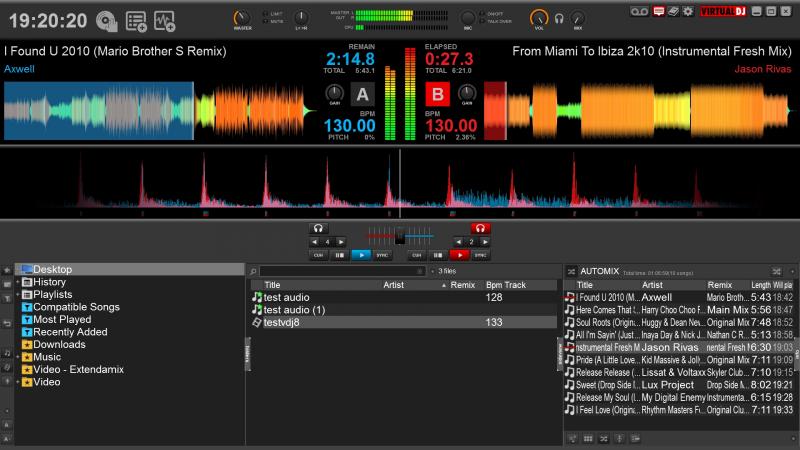
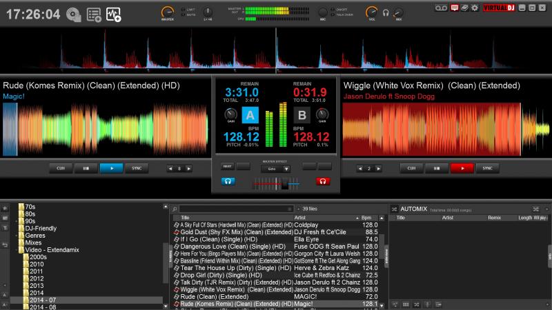
Nearly finished a decent update to my skin (in my opinion!). I have added a third view featuring a large wave area instead of decks, which is designed for me to use my controller with a small laptop.
Also added a record button top right.
Now, what to do about that wide grey waste of space in the middle....
Also added a record button top right.
Now, what to do about that wide grey waste of space in the middle....

发表时间 Sat 27 Sep 14 @ 1:31 pm
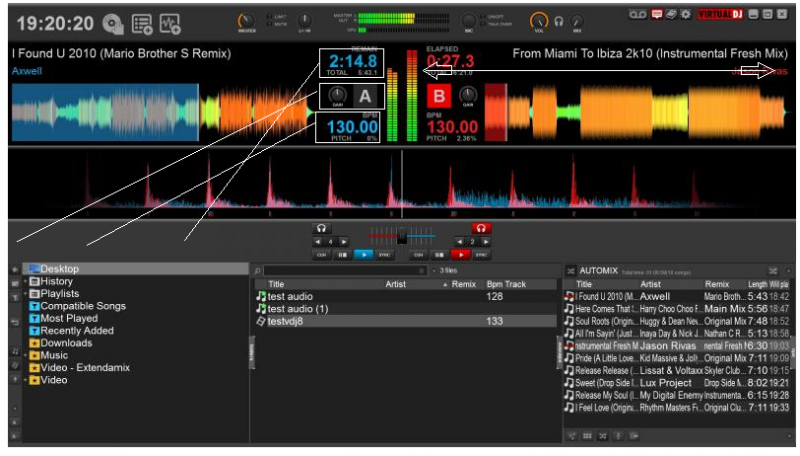
change the positions

发表时间 Sat 27 Sep 14 @ 1:50 pm
I'll have a think..problem with that is that it draws your focus away from the top middle off the screen where all the info is... You would be looking all over the place to get your info.
hmmm many possibilites ;-)
hmmm many possibilites ;-)
发表时间 Sat 27 Sep 14 @ 2:20 pm
Is there a reason to open a new thread for posting updates of an existing skin/thread ?
DOnt you think that the existing thread could host all these information and let others know of your upcoming updates of the same skin ?
DOnt you think that the existing thread could host all these information and let others know of your upcoming updates of the same skin ?
发表时间 Sat 27 Sep 14 @ 6:42 pm
If anyone read them! The links for comments on the skin page means that people have to actively seek out information about that particular skin. Here, anyone interested in skins will find it, and may be tempted to download the skin. I'm also asking for ideas/suggestions from forum users in general....
I often browse the Skins forum, but rarely comment/browse individual skin threads in a particular skin download page.
I concede I did make an error in advising fellow forum members to comment on the Olds'kool download page thread, and not the general Skins section. This led to my original thread being locked :-(
I apologise if etiquette has not been followed.
发表时间 Sat 27 Sep 14 @ 7:22 pm
Hmm for some reason this thread is locked http://www.virtualdj.com/forums/193752/VirtualDJ_Skins/_NEW_SKIN__Olds_kool_(Video_Simples).html
I didnt lock it... did you ask for that from a Moderator ?
I didnt lock it... did you ask for that from a Moderator ?
发表时间 Mon 29 Sep 14 @ 2:16 am
No, but I suspect they might have read my previous comment on that thread (bad idea by me) and wanted to help?
I suppose I should have asked for it to be unlocked, but thought it easier to start a new thread....
I suppose I should have asked for it to be unlocked, but thought it easier to start a new thread....
发表时间 Mon 29 Sep 14 @ 4:30 am
large wave view is now complete! It's coming together nicely...... need to sort out some more funky graphics now, maybe bigger buttons?

发表时间 Thu 02 Oct 14 @ 12:05 pm


