What do you think if.....
Currently artist is displayed on the top line, with title below. How about if clicking on artist changed it to show artist & title on one line?
Then with the top line showing both artist & title, the lower line could be clicked on to show year/genre/comment in one line.
This is easier than trying to shuffle things around and creating new new text areas.
发表时间 Mon 22 Apr 19 @ 1:45 pm
Sure, that would work for me, I'd be happy with any config within these boxes, if I have to click within it or a particular line, then so be it, at least I'd have the said info at my finger tips, instead of having to (as I do at the moment with this skin) have to re-search for the track within the browser to find the info.
So yeah, that'd be great, thank you
So yeah, that'd be great, thank you
发表时间 Mon 22 Apr 19 @ 2:23 pm
Not sure if it works in this skin, but usually the cover art has a tooltip that contains album and year.
The cover art can also be clicked to show a drop-down where one of the options is to open the tag editor so you could look up all the info.
The cover art can also be clicked to show a drop-down where one of the options is to open the tag editor so you could look up all the info.
发表时间 Mon 22 Apr 19 @ 2:43 pm
Ok, I'll take a look at that, thank you
发表时间 Mon 22 Apr 19 @ 3:16 pm
OK here's what I've done. First image is default. Second is clicked.

Normal title and artist

Combi artist - title on top line, info below

Normal title and artist

Combi artist - title on top line, info below
发表时间 Mon 22 Apr 19 @ 3:29 pm
Thank you, that looks exactly what I am after :-)
发表时间 Mon 22 Apr 19 @ 3:45 pm
Now updated to Virtual dj 8.3,fix some minor bugs and change some things
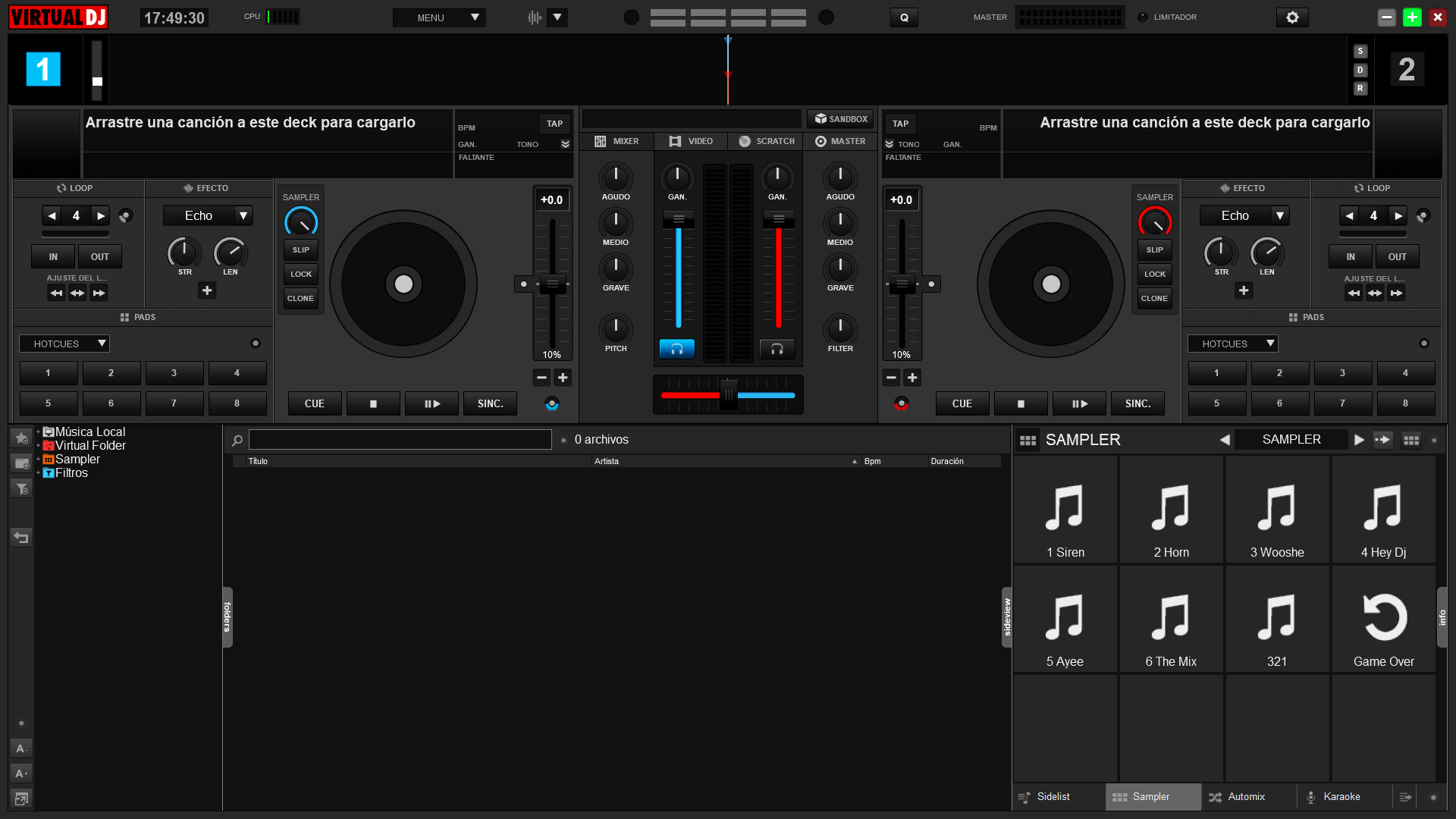
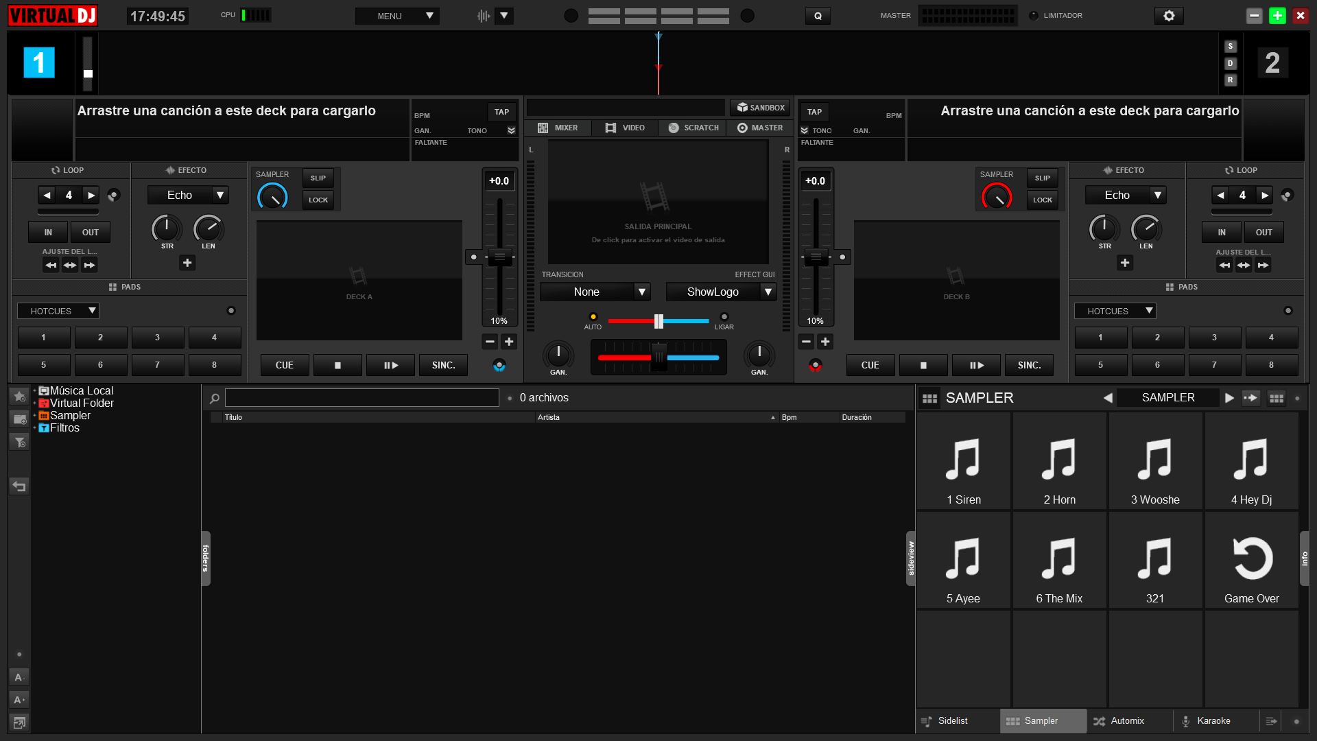
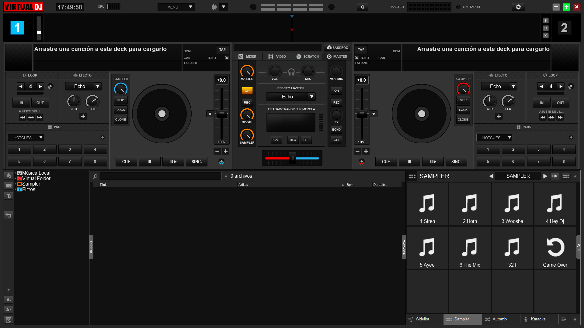
New platter design,more options on master window
In this version the views of 4 and 6 decks were eliminated even though deck 1 and 2 are interchangeable by decks 3 and 4 by pressing the right button of the mouse on the number of the deck or with the deck change button that the controllers
Greetings and thanks
发表时间 Thu 23 May 19 @ 4:09 pm
VDJ DARK updated, cool when is it gonna be ready to download? love it...Thanks for the update.!!!
发表时间 Sat 25 May 19 @ 5:44 pm
in this moment is pending for validate for the developer team
发表时间 Sun 26 May 19 @ 7:15 am
djsantiabella wrote :
Now updated to Virtual dj 8.3,fix some minor bugs and change some things
New platter design,more options on master window
In this version the views of 4 and 6 decks were eliminated even though deck 1 and 2 are interchangeable by decks 3 and 4 by pressing the right button of the mouse on the number of the deck or with the deck change button that the controllers
Greetings and thanks
Hi, why did you eliminate 4 and 6 decks?
发表时间 Sat 06 Jul 19 @ 10:02 pm
skatercorpse wrote :
Hi, why did you eliminate 4 and 6 decks?
djsantiabella wrote :
Now updated to Virtual dj 8.3,fix some minor bugs and change some things
New platter design,more options on master window
In this version the views of 4 and 6 decks were eliminated even though deck 1 and 2 are interchangeable by decks 3 and 4 by pressing the right button of the mouse on the number of the deck or with the deck change button that the controllers
Greetings and thanks
New platter design,more options on master window
In this version the views of 4 and 6 decks were eliminated even though deck 1 and 2 are interchangeable by decks 3 and 4 by pressing the right button of the mouse on the number of the deck or with the deck change button that the controllers
Greetings and thanks
Hi, why did you eliminate 4 and 6 decks?
to lighten the set anyway you can work with 4 decks, these are inverted by clicking on the right button mouse of the deck number or with a controller dedicated button
发表时间 Sun 07 Jul 19 @ 1:40 pm
djsantiabella wrote :
to lighten the set anyway you can work with 4 decks, these are inverted by clicking on the right button mouse of the deck number or with a controller dedicated button
skatercorpse wrote :
Hi, why did you eliminate 4 and 6 decks?
djsantiabella wrote :
Now updated to Virtual dj 8.3,fix some minor bugs and change some things
New platter design,more options on master window
In this version the views of 4 and 6 decks were eliminated even though deck 1 and 2 are interchangeable by decks 3 and 4 by pressing the right button of the mouse on the number of the deck or with the deck change button that the controllers
Greetings and thanks
New platter design,more options on master window
In this version the views of 4 and 6 decks were eliminated even though deck 1 and 2 are interchangeable by decks 3 and 4 by pressing the right button of the mouse on the number of the deck or with the deck change button that the controllers
Greetings and thanks
Hi, why did you eliminate 4 and 6 decks?
to lighten the set anyway you can work with 4 decks, these are inverted by clicking on the right button mouse of the deck number or with a controller dedicated button
Yes I know, I just found it useful to have the option of a 4 decks view and see the 3rd and fourth decks just small under the 1st and 2nd... :)
Hope you will bring it back in the end! :D
发表时间 Wed 10 Jul 19 @ 4:43 pm
any chance of adding a button for the event scheduler on the skin?
发表时间 Sun 29 Dec 19 @ 5:51 am
You can add it yourself, with a custom button.
发表时间 Sun 29 Dec 19 @ 9:29 am
Beautiful . Few minor issues . The blue lights around the white dot (under pitch bend) don't switch off when Auto's are off (except Auto Sync on Play) . Also when i put the mouse pointer on it shows different actions - for example - Master Tempo , Smart Loop.Tnx
发表时间 Mon 28 Feb 22 @ 7:07 pm
I've been wanting a video skin like this forever. Then here you come and grant my wish. Thank you for making my video mixing so much easier. Now I can see both videos clearly, on a larger screen, so transitioning between the two is much more precise. You killed it with this. No changes necessary with this skin.
发表时间 Sat 07 Jun 25 @ 8:07 pm


