I was about to say the same thing.
I am interested in trying out skinning in my spare time but there has to be an "idiots guide" available.
I had a look at the SDK that's currently available and it's all Greek (Sorry Babis :))
I am interested in trying out skinning in my spare time but there has to be an "idiots guide" available.
I had a look at the SDK that's currently available and it's all Greek (Sorry Babis :))
发表时间 Thu 14 Jan 16 @ 8:00 pm
I posted this about a year ago. As it says, I figured it out by studying a (unreleased) djdad skin and also asking Babis directly for advice. I think he's the one to consult. Maybe Dan and George have the knowledge too, but as far as I know, they've not made (released) skins that use <split> code.
The blue browser code is what you see in the earlier post. The part that makes the search area blue must be in there somewhere! I suggest copying and pasting that into a test skin and then changing the colours of each part to one that's nice and obvious (bright red?) to see which area it affects.
I suspect it's this <toolbars background="#004F9E" text="#FFFFFF" iconbackground="#0097C9" border="#999999" />
发表时间 Thu 14 Jan 16 @ 8:25 pm
Did the skin building tool for V8 ever get completed?
There used to be one for V7 made by Jeremie but I don't know if he is still around these days.
There used to be one for V7 made by Jeremie but I don't know if he is still around these days.
发表时间 Thu 14 Jan 16 @ 8:35 pm
I saw that post, yep. :)
Thanks Groovin' for putting me on the right track! I think I'll stick with changing the colors of the default search bar, and with your former post, I think I'll get there!
I'll post my results here...
:)
Thanks Groovin' for putting me on the right track! I think I'll stick with changing the colors of the default search bar, and with your former post, I think I'll get there!
I'll post my results here...
:)
发表时间 Thu 14 Jan 16 @ 8:36 pm
Rather than using splits. Which is very complicated.
You could try using the following
Change the yes to no and you hide that section. This was previously missing from the Wiki but was added yesterday. This makes it much easier to modify the browser appearance.
I've also requested a couple of other things that will hopefully appear in a future release.
You could try using the following
browser toolbar="yes" sideview="yes" folders="yes" infos="yes" effects="yes">
Change the yes to no and you hide that section. This was previously missing from the Wiki but was added yesterday. This makes it much easier to modify the browser appearance.
I've also requested a couple of other things that will hopefully appear in a future release.
发表时间 Thu 14 Jan 16 @ 8:48 pm
That's exactly what I have done, Dan!
:)
I'll post a pic as soon as I got the custom icons down!
:)
I'll post a pic as soon as I got the custom icons down!
发表时间 Thu 14 Jan 16 @ 9:23 pm
My "custom" browser ;)
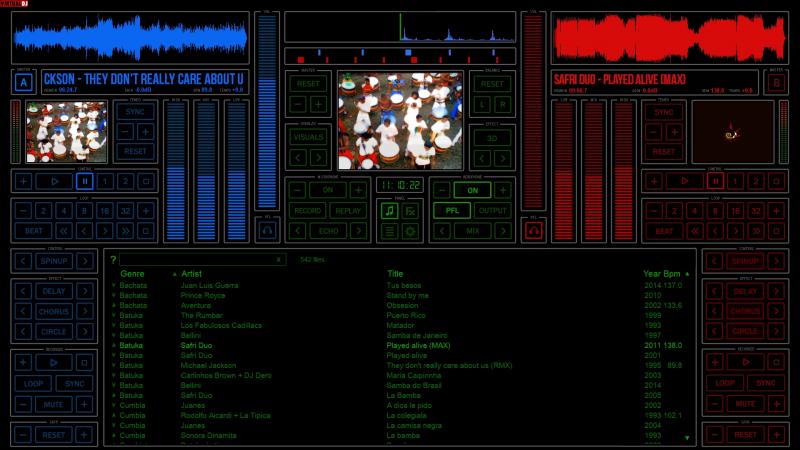
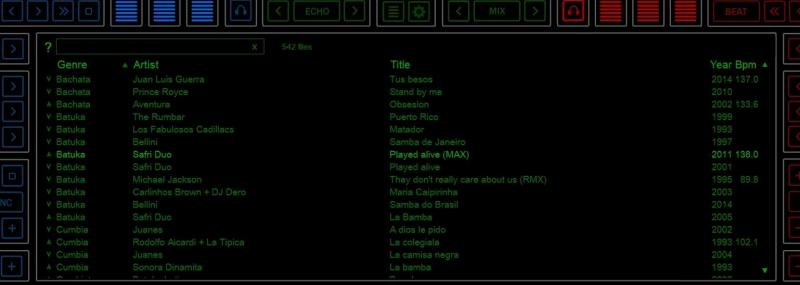
Done with: customicons, and with : toolbars background, iconbackground and border in the browser section.


Done with: customicons, and with : toolbars background, iconbackground and border in the browser section.
发表时间 Sat 16 Jan 16 @ 11:14 am
Congratulations :-)
发表时间 Sat 16 Jan 16 @ 11:16 am
Thank you... and... thank YOU, Groovin' (and Dan and Babis) !!!
:)
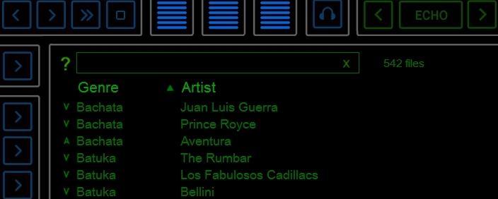
:)

发表时间 Sat 16 Jan 16 @ 11:17 am
Looks nice - well done
发表时间 Sat 16 Jan 16 @ 11:44 am
I've added another property to the browser element which will be available in the next build; searchbar="no". This will allow you to remove the search bar from the file list (and thus create your own using <edit> elsewhere).
This gives you flexibility to create custom browsers to suit most situations without even needing to worry about <split> :)
This gives you flexibility to create custom browsers to suit most situations without even needing to worry about <split> :)
发表时间 Sat 16 Jan 16 @ 3:37 pm
That's GREAT Scott!!!
(no pun intended LOL)
(no pun intended LOL)
发表时间 Sat 16 Jan 16 @ 4:03 pm
Deejay Corny wrote :
GREAT Scott!!!

发表时间 Sat 16 Jan 16 @ 4:36 pm
Is the <edit> command documented anywhere?
发表时间 Sat 16 Jan 16 @ 5:03 pm
Not currently but....
I think that covers it. Essentially it gives you only the search box.
<edit>
<pos x="0" y="0" width="0" height="0"/>
<colors background="#2E2E2E" border="#2E2E2E" selected="#2E2E2E" text="#2E2E2E" cursor="#2E2E2E" />
<fontsearch size="0"/>
</edit>
I think that covers it. Essentially it gives you only the search box.
发表时间 Sat 16 Jan 16 @ 5:16 pm
Do we have "like icons" on this forum for posts you really like?
;)
P.S.: Does this code need to be inside the browser (or filelist) container, or can one make a panel with a search box elsewhere, while the results popup on the filelist/browser panel?
;)
P.S.: Does this code need to be inside the browser (or filelist) container, or can one make a panel with a search box elsewhere, while the results popup on the filelist/browser panel?
发表时间 Sat 16 Jan 16 @ 5:29 pm
It can be anywhere you like.
发表时间 Sat 16 Jan 16 @ 5:35 pm
GREAT!!!
发表时间 Sat 16 Jan 16 @ 5:36 pm
Missing / at end of POS line
<edit>
<pos x="252" y="601" width="1413" height="49"/>
<colors background="transparent" border="transparent" selected="transparent" text="#00A600" cursor="transparent" />
<fontsearch size="24"/>
</edit>
<edit>
<pos x="252" y="601" width="1413" height="49"/>
<colors background="transparent" border="transparent" selected="transparent" text="#00A600" cursor="transparent" />
<fontsearch size="24"/>
</edit>
发表时间 Sat 16 Jan 16 @ 6:43 pm
Apologies - i edited your post rather than quoting it - but answer above.
发表时间 Sat 16 Jan 16 @ 6:53 pm


