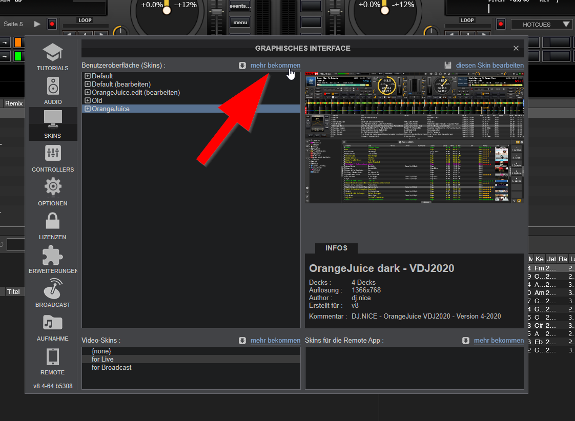
I'm a disaster. Would you please take a capture of where the update option is? I don't find it inside the skin or the VDJ menu.
发表时间 Thu 10 Oct 19 @ 8:58 pm
发表时间 Fri 11 Oct 19 @ 7:09 am
发表时间 Fri 11 Oct 19 @ 8:31 am
The new version isn't available yet. You can see here that it's v3.9
DJ Nice only uploaded v4 two days ago, and it has to be approved by Atomix before being made available.
You need to be patient and wait a while longer :-)
DJ Nice only uploaded v4 two days ago, and it has to be approved by Atomix before being made available.
You need to be patient and wait a while longer :-)
发表时间 Fri 11 Oct 19 @ 8:42 am
You're right Groovin, thank you. In any chance I can't update from v.3.8 to v.3.9 so I am going to wait a few days and download the last version.
发表时间 Fri 11 Oct 19 @ 8:45 am
send me an eMail and you will get a personal preview ;-)
发表时间 Fri 11 Oct 19 @ 5:20 pm
That's very kind of you, message sent ;-)
发表时间 Fri 11 Oct 19 @ 5:37 pm
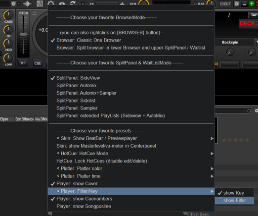
Hello to everybody, is it me or it hasn't filter knobs for the controller?
发表时间 Mon 21 Oct 19 @ 7:30 am
eliasFMC wrote :
Hello to everybody, is it me or it hasn't filter knobs for the controller?
You can switch between a key knob and a filter knob in the skin settings
发表时间 Mon 21 Oct 19 @ 8:27 am
When in AutoMix is there a way to have the active deck not show the Preview of Next songs, and just have it stay like it is when not in AutoMix?
I want access to looping and pads....
Thank you
I want access to looping and pads....
Thank you
发表时间 Mon 04 Nov 19 @ 1:40 pm
DJ Riot Grrrl wrote :
When in AutoMix is there a way to have the active deck not show the Preview of Next songs, and just have it stay like it is when not in AutoMix?
I want access to looping and pads....
Thank you
I want access to looping and pads....
Thank you
togge all previewmodes with the [INFO] Button
no preview

extended infos next song

next 3 songs

发表时间 Sat 09 Nov 19 @ 11:29 pm
Absolutely in love with this skin, is a masterwork.
Just to be perfect I would like to get a more darker background, not so grey as the actual one, in the line of the almost completely black VDJ DARK or BLOCK skins. It looks nicer with the better contrast imho.
ORANGEJUICE

BLOCKS and VDJ DARK

It is far more obvious the color tone difference watching the skin in full screen rather than with these small captures.
Can I do it myself editing anything Alex?
Cheers
Just to be perfect I would like to get a more darker background, not so grey as the actual one, in the line of the almost completely black VDJ DARK or BLOCK skins. It looks nicer with the better contrast imho.
ORANGEJUICE

BLOCKS and VDJ DARK

It is far more obvious the color tone difference watching the skin in full screen rather than with these small captures.
Can I do it myself editing anything Alex?
Cheers
发表时间 Mon 11 Nov 19 @ 5:34 pm
If you just change the background colour (the large grey block at the top of the PNG file), you won't see much difference because it's mainly hidden by other graphics which sit on top.
I just tried to add background colour here, but found that it's going to more involved. :-)
I just tried to add background colour here, but found that it's going to more involved. :-)
发表时间 Mon 11 Nov 19 @ 6:22 pm
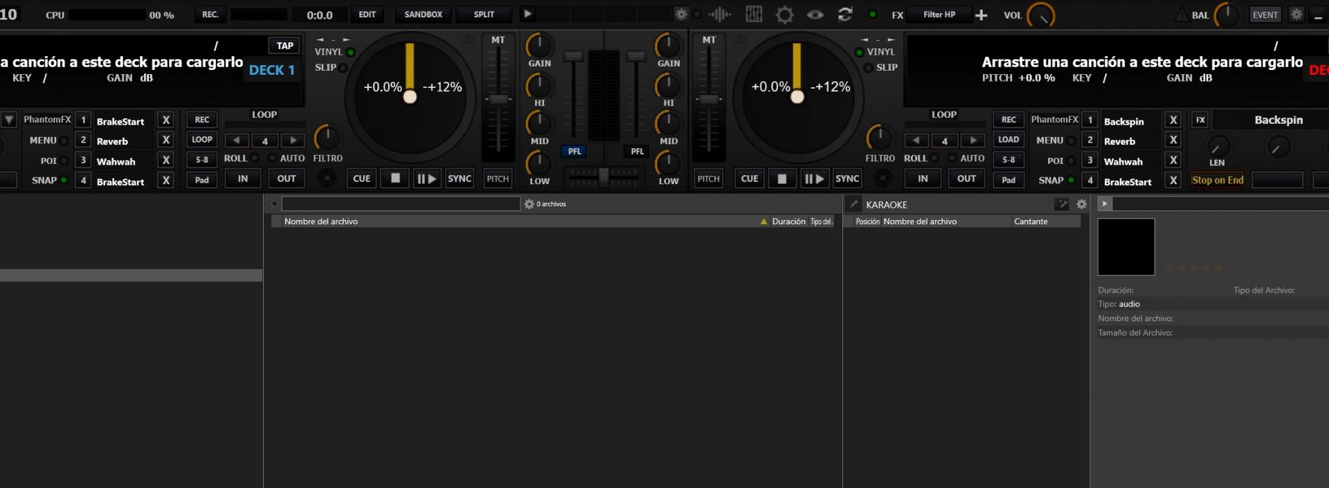
Well, editing the PNG file I've got a darker background in the upper side (decks and mixer) but affects to all the elements - not only the background - that are not now less vibrant. The browser remains grey, so no success! :-)

发表时间 Mon 11 Nov 19 @ 6:52 pm
This is what happens when you don't have any skills to do such things :-)
发表时间 Mon 11 Nov 19 @ 7:03 pm
serieB wrote :
Well, editing the PNG file I've got a darker background in the upper side (decks and mixer) but affects to all the elements - not only the background - that are not now less vibrant. The browser remains grey, so no success! :-)


do you know how to edit the XML file ? you can make the lower browser area black also sir
发表时间 Fri 15 Nov 19 @ 3:00 am
serieB wrote :
Well, editing the PNG file I've got a darker background in the upper side (decks and mixer) but affects to all the elements - not only the background - that are not now less vibrant. The browser remains grey, so no success! :-)


if your not good with editing xml files just use "Browser Tweaks" i use it all the tyme to edit my skins to make them black in the browser area its my by DJ Dad here on the site who is a skin master LOL
发表时间 Fri 15 Nov 19 @ 3:14 am
djtyme209 wrote :
if your not good with editing xml files just use "Browser Tweaks" i use it all the tyme to edit my skins to make them black in the browser area its my by DJ Dad here on the site who is a skin master LOL
serieB wrote :
Well, editing the PNG file I've got a darker background in the upper side (decks and mixer) but affects to all the elements - not only the background - that are not now less vibrant. The browser remains grey, so no success! :-)


if your not good with editing xml files just use "Browser Tweaks" i use it all the tyme to edit my skins to make them black in the browser area its my by DJ Dad here on the site who is a skin master LOL
Thank you djtyme209, I'm going to try that way. :-)
发表时间 Fri 15 Nov 19 @ 7:06 am
serieB wrote :
Thank you djtyme209, I'm going to try that way. :-)
djtyme209 wrote :
if your not good with editing xml files just use "Browser Tweaks" i use it all the tyme to edit my skins to make them black in the browser area its maid by DJ Dad here on the site who is a skin master LOL
serieB wrote :
Well, editing the PNG file I've got a darker background in the upper side (decks and mixer) but affects to all the elements - not only the background - that are not now less vibrant. The browser remains grey, so no success! :-)


if your not good with editing xml files just use "Browser Tweaks" i use it all the tyme to edit my skins to make them black in the browser area its maid by DJ Dad here on the site who is a skin master LOL
Thank you djtyme209, I'm going to try that way. :-)
发表时间 Fri 15 Nov 19 @ 8:36 am
Editing the skin with "Browser Tweaks" and Photo Filtre for the top area, this is how it looks with the darker background :
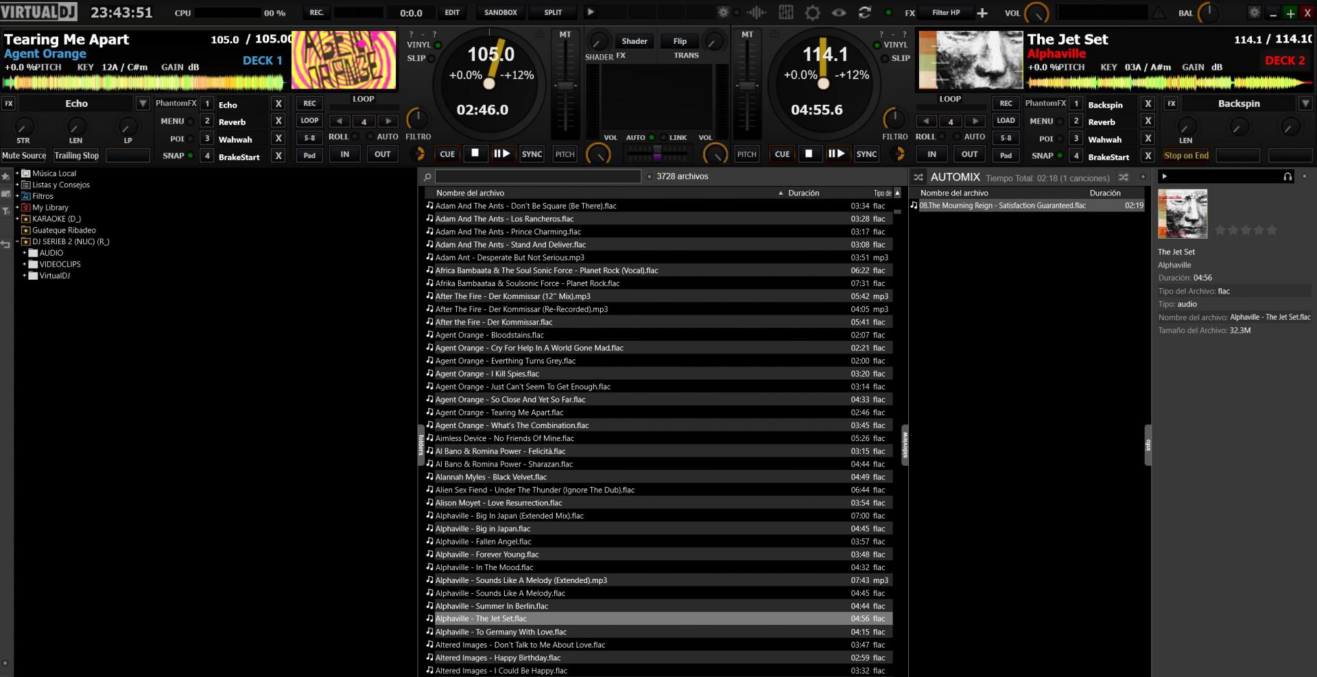
I was unable to change the background colour of the pre-listen area, not really a big deal after all.
PS: One thing I don't like is how the covers are showed in the players. Furthermore not complete, they are truly pixelated because of the default zoom applied.
Any chance to fix this issue for next updates?
发表时间 Fri 15 Nov 19 @ 10:42 pm


