I think the language difference is a problem here.
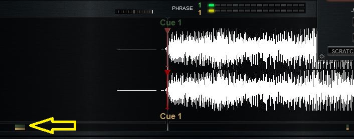
Yes the CBG is sync'd but it's out of line with the scratch wave.
You could move the CBG backwards in the skin so they are in line.
Here is an example from my WIP skin (forgive the errors)
http://pbrd.co/1AlII3Y
See that the default wave (top) is in the normal place, centred on the centre but the scratch wave (bottom) is centred to the first left quarter (so I can see more of the future)
Honestly I need to move the CBG graphics a little bit more to the right so that the CBG and the scratchwave are perfectly in line.
It's a great skin (yours) but the out of line issue is fixable.
发表时间 Thu 20 Nov 14 @ 2:25 am
Indeed my English is not very good ... but with the help of my friend Fruit I finally understood!
the CBG below rhythmzone are not centered in scratchwave mode?

I have other small corrections to do and I'll add this one !!
So coming soon :
- Correction "rename" mode for the Hot Cues deck 2
- Correction display bug in the OPTIONS pannel
- Adding central bar on the deck 2 scratchwave
the CBG below rhythmzone are not centered in scratchwave mode?


I have other small corrections to do and I'll add this one !!
So coming soon :
- Correction "rename" mode for the Hot Cues deck 2
- Correction display bug in the OPTIONS pannel
- Adding central bar on the deck 2 scratchwave
发表时间 Thu 20 Nov 14 @ 12:14 pm
The 3 corrections are uploaded and I add a fourth : the center of the CBG ;-)
发表时间 Tue 25 Nov 14 @ 7:39 am
Great work, like it! Hope you continue working on this skin ...
Greetz
Greetz
发表时间 Thu 27 Nov 14 @ 2:33 pm
Dodge57, I have just downloaded this skin and found several spelling mistakes. You are excused as you are French :-)
Also I noticed that the "get version" text is too far left (hidden behind the VDJ logo). I moved it to pos x="80".
Also I noticed that the "get version" text is too far left (hidden behind the VDJ logo). I moved it to pos x="80".
发表时间 Thu 27 Nov 14 @ 2:59 pm
That's right, the VDJ version is hidden ... amazing that I did not notice that!
Thank you!
Can you tell me where I made spelling mistakes ...
Thank you!
Can you tell me where I made spelling mistakes ...
发表时间 Thu 27 Nov 14 @ 3:30 pm
Many times you have used clic instead of click.
On the two mini decks (big browser) the top deck is called DECK 1 and the bottom is called deck 2 - not spelling but still upper vs lower case.
On the custom button menus you have typed "means" when it should be "medium". Also "more slot" and "less slot" should be plural (slots).
On the rhythmwave choices, the correct word is "split" not "splitted".
On the options buttons, you have "hide mixe supports" which I think should be "hide CBG adjust".
I think that's all :-)
Oh I just found something else. The 'tagtext' class (tooltip = "select your tags") is too wide. It runs over the 'key panel' buttons on each deck. Width is 98 but I changed it to 68.
发表时间 Thu 27 Nov 14 @ 3:51 pm
Groovindj thank you for reported all these errors, indeed my English is too bad for noticing it !!! :-)
I put these corrections in the next update !
I put these corrections in the next update !
发表时间 Fri 28 Nov 14 @ 6:05 am
[deleted]
发表时间 Tue 02 Dec 14 @ 3:59 pm
!
发表时间 Wed 03 Dec 14 @ 4:44 pm
I have been abroad for some time but I can finally resume work on the skin.
Spelling mistakes are corrected (thanks groovindj), but there are two problems:
It's not just the adjusted CBG adjust which is masked, but also the phraser and the sync indicator
I don't understand what is the problem, with me everything looks correct :
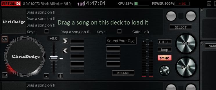
Spelling mistakes are corrected (thanks groovindj), but there are two problems:
groovindj wrote :
On the options buttons, you have "hide mixe supports" which I think should be "hide CBG adjust".
It's not just the adjusted CBG adjust which is masked, but also the phraser and the sync indicator
groovindj wrote :
Oh I just found something else. The 'tagtext' class (tooltip = "select your tags") is too wide. It runs over the 'key panel' buttons on each deck. Width is 98 but I changed it to 68.
I don't understand what is the problem, with me everything looks correct :

发表时间 Mon 15 Dec 14 @ 8:06 am
I suggest "hide mix tools".
The problem with the class=tagtext is that with a width of 98, it prevents the "Key Panel" tooltip from showing when the mouse pointer is over the key buttons. Instead it shows "Select your tags".
By the way, I have been reworking your skin - putting the decks side by side (with songpos waves above) and changing a few things. Work is in progress :-)
发表时间 Mon 15 Dec 14 @ 8:25 am
groovindj wrote :
I suggest "hide mix tools"
it's true that it's better!
For textzone tagTEXT, if I reduced the width then the tags are too short, and you no longer see them properly ... I prefer it that way, too bad for the tooltip of the little key button, people will understand ! ;-)


发表时间 Mon 15 Dec 14 @ 9:32 am
I solved it: Create a new class called keytext (width 68) and use that for the key textzone. Leave all the others at width 98. :-)
发表时间 Mon 15 Dec 14 @ 10:27 am
Hi Chris,
What do you think of this (marked red):
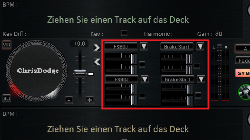
I reworked the effect menue with "paint" (ony the .pgn), copied the effect buttons and the custom sliders from above.
It's only an idea... ;-)
Greetz
What do you think of this (marked red):

I reworked the effect menue with "paint" (ony the .pgn), copied the effect buttons and the custom sliders from above.
It's only an idea... ;-)
Greetz
发表时间 Mon 15 Dec 14 @ 11:24 am
You use more than 2 effects ?
Yes it's possible to modifie this, I look for that
Yes it's possible to modifie this, I look for that
发表时间 Mon 15 Dec 14 @ 1:16 pm
Dodge57 wrote :
You use more than 2 effects ?
Yes it's possible to modifie this, I look for that
Yes it's possible to modifie this, I look for that
sometimes, yes. ;-)
Thanks!
Greetz
发表时间 Tue 16 Dec 14 @ 4:28 pm


