The colors have been changed. The main problem was not the colors by themselves but their big variation... It may take a while until you get used to the colors and I realize that. While I am a fan of color coding elements as Key, BPM, Elapsed & Remain time for easy recognition (See Ghost OSD), I now used a different approach. I will post a screenshot later...
PS: This is not MY skin, so I'm always open to suggestions. I'm just the "driver" here ;)
PS: This is not MY skin, so I'm always open to suggestions. I'm just the "driver" here ;)
发表时间 Thu 29 Sep 11 @ 9:05 am
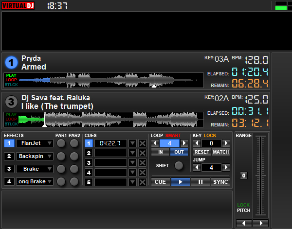
New Colors, New layout for the display... I hope you like it better...
发表时间 Thu 29 Sep 11 @ 10:41 am
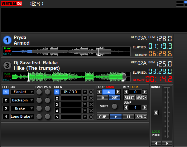
发表时间 Thu 29 Sep 11 @ 10:42 am
Much Better
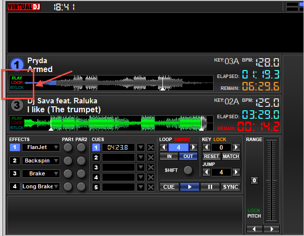
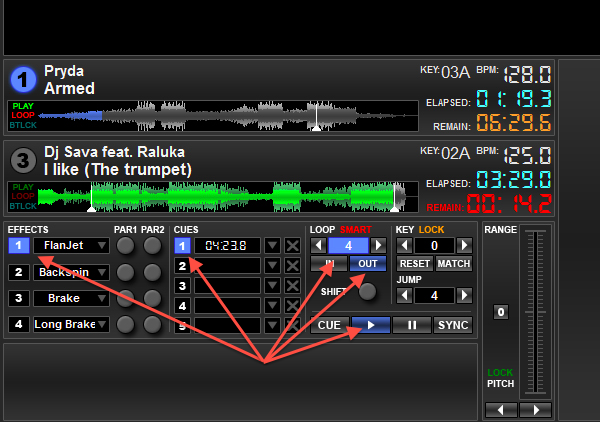
What are these three here for? and is there any significance to them been in different colours?
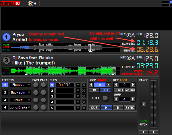
Also if you could make the elapsed in white or off white (the same as) and change remain to the same colour as the deck colour. e.g. deck 1 blue
deck 2 green etc
The one outlined looks better than the one below it with the bigger font for remain. Better to blink than to enlarge and turn colour.
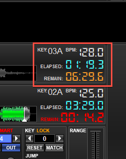
If you select the 3rd deck do the colours that I\'ve pointed to below change to green?
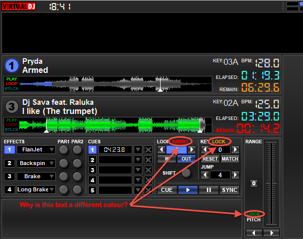
There are 2 different shades of blue which looks bad.

What are these three here for? and is there any significance to them been in different colours?

Also if you could make the elapsed in white or off white (the same as) and change remain to the same colour as the deck colour. e.g. deck 1 blue
deck 2 green etc

The one outlined looks better than the one below it with the bigger font for remain. Better to blink than to enlarge and turn colour.

If you select the 3rd deck do the colours that I\'ve pointed to below change to green?


There are 2 different shades of blue which looks bad.

发表时间 Thu 29 Sep 11 @ 1:20 pm
发表时间 Thu 29 Sep 11 @ 2:43 pm

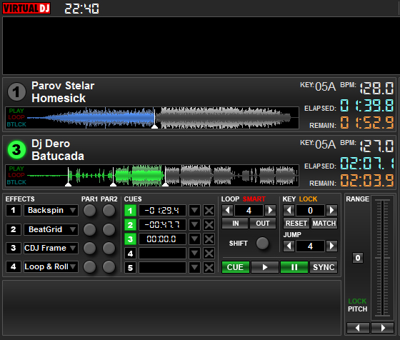
And a phaser!!!
发表时间 Thu 29 Sep 11 @ 4:52 pm
As far as the Elapsed/Remain goes i much prefer having them as EL/RM if it means the full track waveform is gonna be longer and thus more detailed. It makes it much easier to see coming breakdowns and in general to estimate the length in beats between the phases.
I also dont think having the entire word (elapsed/remain) fully spelled out matches the look of the skin. Its not symmetric and it looks awkward.
I do like having the two different shades of blue. It helps to quickly focus in on the info that you need. Instead of it being on big seamless blue blob, if there are two different shades i know which one to focus on for my loop length info and for my in/out info button.
Similarly i dont mind having the Smart loop, key Lock and Pitch lock buttons be different colors.
Having the hotcue and button colors match the color of the deck is just a fantastic cherry on top.
发表时间 Thu 29 Sep 11 @ 5:45 pm
Ok,
Looks like you and Phantom have the same style in which case I'll let you get on with it seen as you were the one to initiate the project.
Looks like you and Phantom have the same style in which case I'll let you get on with it seen as you were the one to initiate the project.
发表时间 Thu 29 Sep 11 @ 5:58 pm
Its a community project with the design being at Phantom's discretion.
I am just putting forth my view of what would make the skin more functional and its no more or less important than anyone else's.
I am just putting forth my view of what would make the skin more functional and its no more or less important than anyone else's.
发表时间 Thu 29 Sep 11 @ 10:48 pm
Hi Phantom,
great job.
I would prefer the mixer in 3-1-2-4 logic, as said @ begin of this project.
...and a phaser....wow!!!
Would be a great name imO ?!?
;o)
great job.
I would prefer the mixer in 3-1-2-4 logic, as said @ begin of this project.
...and a phaser....wow!!!
Would be a great name imO ?!?
;o)
发表时间 Fri 30 Sep 11 @ 2:02 am
Mixer is ALMOST ready...
Layout 1-2-3-4:
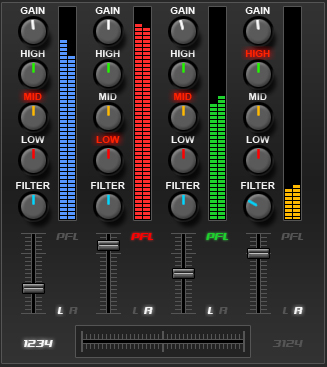
Layout 3-1-2-4:
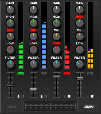
More to come soon!
Layout 1-2-3-4:

Layout 3-1-2-4:

More to come soon!
发表时间 Fri 30 Sep 11 @ 6:56 am
this is easily the best most feature packed skin in vdj history, im a fan, but not of the coloured eq's, i think it makes the levels harder to see... fingers crossed fo the sampler... i'll pm you a smart hot loop, hopefully you can include it in the skin :)
发表时间 Fri 30 Sep 11 @ 7:08 am
Guys, just to "clear" up a few things:
Most of the colors of the skin can be tweaked/changed by editing the XML file, and not the graphics. Almost all texts are in textzones (like the Elapsed/Remain/Key titles e.t.c...) and not hardcoded on the graphics
Also inside the skin file there are 5 different types of colored knobs. This means that if you want for instance to make all them white all you have to do is to change the knob coordinates inside the XML file.
Also, a lot of functions can be disabled by deleting their section on the XML.
Once I'm ready to release the skin we can talk about colors e.t.c... Right now I'm trying to focus on functions & coding. Going back all the time to tweak colors is time consuming and it keeps this skin in progress for longer time. (Thus you'll get your hands on it later)
Finally, while I DO want comments / constructive criticism , please be a little patient in order to see the "whole" and not just parts... I'm trying my best to blend everything together nicely and this ain't easy especially since I'm trying to fulfill several persons wishes and options at the same time... Like playing music in front of an audience you can't please everyone at the same time, and you can't please everyone the same!
We as DJ's should know this better than anyone!!!
Thank you!
PS: Keep up the comments. They really bring me new ideas and I keep changing and improving several things that I haven't showed you yet!!!
发表时间 Fri 30 Sep 11 @ 7:50 am
The ability to switch from 1234 to 3124 right on the skin is pretty badass.
I am not sure if this will be an issue but some skins do not allow you to drag and drop a music file from an external (actual windows folder) into a deck. This is not an essential feature but would be nice to have as an option.
I am not sure if this will be an issue but some skins do not allow you to drag and drop a music file from an external (actual windows folder) into a deck. This is not an essential feature but would be nice to have as an option.
发表时间 Fri 30 Sep 11 @ 8:15 am
MeowMix wrote :
The ability to switch from 1234 to 3124 right on the skin is pretty badass.
Full agree!
Very, very nice ;o)
发表时间 Fri 30 Sep 11 @ 8:25 am
Has this skin got a midi scan button on it?
发表时间 Fri 30 Sep 11 @ 9:48 am
All my skins have a CONTROLLER SCAN / CONTROLLER REFRESH button if that's what you mean... I introduced this button on the Ghost skin and I will never create a skin without it.
If you look close on the top bar of the skin you will see a button with a USB icon on it. That's the controller scan/refresh button (+ reinitialize)
If you look close on the top bar of the skin you will see a button with a USB icon on it. That's the controller scan/refresh button (+ reinitialize)
发表时间 Fri 30 Sep 11 @ 9:57 am
MeowMix wrote :
The ability to switch from 1234 to 3124 right on the skin is pretty badass.
I am not sure if this will be an issue but some skins do not allow you to drag and drop a music file from an external (actual windows folder) into a deck. This is not an essential feature but would be nice to have as an option.
I am not sure if this will be an issue but some skins do not allow you to drag and drop a music file from an external (actual windows folder) into a deck. This is not an essential feature but would be nice to have as an option.
This skin has six (yes six) drag n drop zones...
1 on each deck (deck 1, 2, 3 and 4) and 1 for left and right deck on the player control area (that's where the effects, cues, loops pitch e.t.c. is located)
The only area right now that you can't drag something is the "sampler" area...
发表时间 Fri 30 Sep 11 @ 10:02 am
I just realized there are a couple of things that had not fully thought through for this skin.
Disclaimer: keep in mind this skin is meant to give you full access to VDJ features while using a 4 deck controller. The idea is that you can do everything you need without having to touch your computer.
This is as much of a mapping issue as it is a skinning one but the two are very related and if we can implement these features I would be happy to create customizable mappings to match.
The fact that the skin has 4 effect slots is already fantastic.
However, what happens when you are activating more than 1 effect at the same time? How do you change/control the various parameters for each effect without affecting the other active effects?
Most current 4 deck controllers (and some 2 deck) have 4 EFX knobs that you can use to change the effect parameters. This works great when using 1 effect. You can use all 4 knobs to change 4 different parameters of that effect. However when using chaining (multiple active) effects it gets a lot more tricky.
One method to control chaining effects that is used by Traktor is to use knob #1 as an overall Dry/Wet while the other 3 knobs become sort of superknobs simultaneously modifying multiple parameters of the effect assigned to them. The good of this method is that you can simultaneously modify 3 effects, the bad is that you have no control over how the parameters of the 3 effects change and, they are all on the same Dry/Wet level.
The method i have been thinking of allows you to independently control 2 parameters on each active effect although you can only do independent changes to only 1 effect at a time. It involves a highlight/scroll system. You would use a knob or a button to scroll/highlight one of the 4 effects on the skin without changing its on/off status. Once highlighted you can change its parameters without affecting the parameters of the other effect slots.
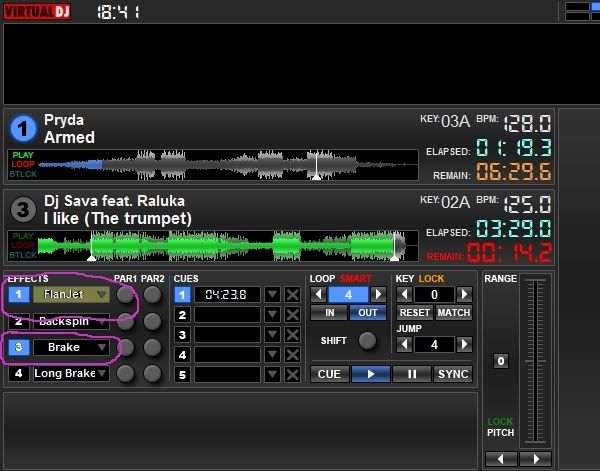
In the picture below effects 1 and 3 are active but only the FlanJet (effect 1) is highlighted so when you change the parameters it will only apply to effect 1. You can even highlight and modify an effect that is not active.
This method can also be applied to another issue ive had with VDJ for some time. The lack of highlighting when scrolling through samples witha controller. Currently the only way you can get visual feedback of the sample you want to modify is to either use the laptop mouse or activate the sample than change its loop length*, volume and beat sync.
The visual feedback of the scroll/highlight method allows you to see which sample is selected and to modify its volume without having to turn it on or use your mouse.
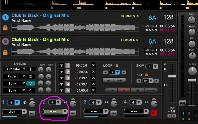
In the picture below samples 1 and 3 are active but sample 2 is highlighted. That way i can change the volume of sample 2 without having to worry about messing with the active samples.
*the loop length visual/numerical feedback is a pending feature up to Phantom's scripting wizardry.
If we really want get fancy we can use the SHIFT function to scroll/highlight multiple samples (and effects) and simultaneously change their volumes (and parameters).
I know these are more complicated features and i dont want to add to the ton of work Phantom has already done but these can also help improve our mixing level and also make functional some of the hidden and unused features that VDJ has. Again if Phantom can code these i will gladly write the mapping scripts for them.
Disclaimer: keep in mind this skin is meant to give you full access to VDJ features while using a 4 deck controller. The idea is that you can do everything you need without having to touch your computer.
This is as much of a mapping issue as it is a skinning one but the two are very related and if we can implement these features I would be happy to create customizable mappings to match.
The fact that the skin has 4 effect slots is already fantastic.
However, what happens when you are activating more than 1 effect at the same time? How do you change/control the various parameters for each effect without affecting the other active effects?
Most current 4 deck controllers (and some 2 deck) have 4 EFX knobs that you can use to change the effect parameters. This works great when using 1 effect. You can use all 4 knobs to change 4 different parameters of that effect. However when using chaining (multiple active) effects it gets a lot more tricky.
One method to control chaining effects that is used by Traktor is to use knob #1 as an overall Dry/Wet while the other 3 knobs become sort of superknobs simultaneously modifying multiple parameters of the effect assigned to them. The good of this method is that you can simultaneously modify 3 effects, the bad is that you have no control over how the parameters of the 3 effects change and, they are all on the same Dry/Wet level.
The method i have been thinking of allows you to independently control 2 parameters on each active effect although you can only do independent changes to only 1 effect at a time. It involves a highlight/scroll system. You would use a knob or a button to scroll/highlight one of the 4 effects on the skin without changing its on/off status. Once highlighted you can change its parameters without affecting the parameters of the other effect slots.
In the picture below effects 1 and 3 are active but only the FlanJet (effect 1) is highlighted so when you change the parameters it will only apply to effect 1. You can even highlight and modify an effect that is not active.

This method can also be applied to another issue ive had with VDJ for some time. The lack of highlighting when scrolling through samples witha controller. Currently the only way you can get visual feedback of the sample you want to modify is to either use the laptop mouse or activate the sample than change its loop length*, volume and beat sync.
The visual feedback of the scroll/highlight method allows you to see which sample is selected and to modify its volume without having to turn it on or use your mouse.
In the picture below samples 1 and 3 are active but sample 2 is highlighted. That way i can change the volume of sample 2 without having to worry about messing with the active samples.
*the loop length visual/numerical feedback is a pending feature up to Phantom's scripting wizardry.

If we really want get fancy we can use the SHIFT function to scroll/highlight multiple samples (and effects) and simultaneously change their volumes (and parameters).
I know these are more complicated features and i dont want to add to the ton of work Phantom has already done but these can also help improve our mixing level and also make functional some of the hidden and unused features that VDJ has. Again if Phantom can code these i will gladly write the mapping scripts for them.
发表时间 Fri 30 Sep 11 @ 12:44 pm


